mobile website mistakes
7 Mobile Website Mistakes That Make Customers Leave
Most of your visitors are on a phone, ready to act. These 7 common mobile mistakes quietly send them to competitors, and each one is quick to fix.
Conversion UXUpdated 2 min readBy Kanchana Delgoda, Search and AI visibility
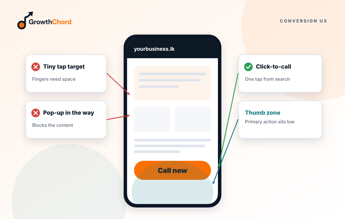
Short answer: the seven mistakes that lose mobile customers are slow loading, no tap-to-call button, text that is too small, pop-ups that cover the page, forms that are too long, menus that hide key pages, and no clear next step. Most take hours, not weeks, to fix.
In Sri Lanka, most people searching for a business are on a phone, often on mobile data. They found you, which is the hard part. Then the page loses them in seconds. Here are the usual culprits.
1. Is your page too slow?
If the page takes more than a few seconds to show anything, many visitors give up. Big uncompressed photos, sliders and too many plugins are the usual causes. Compress images, remove what you do not need, and use good hosting.
2. Can people call you with one tap?
A phone number written as plain text, or hidden in the footer, costs calls. Put a "Call" and a "WhatsApp" button at the top of the page, and keep a sticky button visible as people scroll.
3. Can people read without zooming?
Small text, light grey on white, and long paragraphs are hard on a small screen. Use a readable size, strong contrast and short paragraphs.
4. Do pop-ups block the page?
A full-screen pop-up asking for an email address before the visitor has seen anything is the fastest way to lose them. If you must use one, make it small, delay it, and make it easy to close.
5. Are your forms too long?
Ten fields on a phone feels like work. Ask only for what you need to reply: name, phone or email, and a short message. Offer WhatsApp as an alternative.
6. Is the menu hiding what people want?
If prices, services and contact details are buried three taps deep, people will not find them. Put the most important links where they can be seen straight away, and keep the menu short.
7. Is there a clear next step?
Every page should end with one obvious action: call, message, book or get a quote. Pages that just stop leave visitors unsure what to do.
How do you check your own site?
Use your phone on mobile data. Pretend you are a new customer. Try to find out what you offer, what it costs and how to contact you. Time it. If it takes more than a minute or you feel annoyed, so do your customers.
Our web development service builds sites around these rules. Want a quick mobile check of your current site? Request a free growth audit.
- Conversion UX
- Landing Pages
- CRO